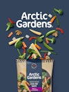
Launched in 1987, Arctic Gardens is a high-quality vegetable brand, both in terms of the diversity of its offer and its production methods. However, over time, the brand image no longer met the needs of modern consumers, and it had to be changed. The brand needed to re-invigorate its consumer base and appeal to a new generation of parents looking for healthy food for their families.
The challenge for the PIGEON team was to re-launch a brand that was well-established, but facing increasing competition. A major injection of freshness was needed to send a strong signal to the market to highlight and enhance the brand’s perceived value.
The need for a strategic approach was expressed through new brand positioning, a new territory, a new brand ecosystem, a brand book, and a new packaging platform.
This exercise in thinking demonstrated the opportunity to brand Arctic Gardens as a responsible and generous brand that offers quality products with unparalleled freshness. As the name suggests, its freezing methods, which preserve all the food’s nutritional qualities, are inspired by Arctic conditions. To give the brand meaning beyond the practical and culinary aspects of frozen vegetables, and to give it more flexibility, Arctic Gardens is positioned as a home-grown brand (from northern North America) which helps consumers be smart and creative in consuming more vegetables. This is what inspired the brand’s new essence and the positioning which is ‘Nordic Freshness’.
Arctic Gardens is now paying homage to its methods and its know-how. A brand where farmers and artisans work together with nature in a sustainable way, taking care of the land. A whole family of home-grown vegetables, including a range tested for pesticide residues, are part of the product portfolio. The revitalization and positioning of the brand allow it to stay relevant with the new generation of young parents, for whom vegetables are the ideal cost-effective solution for providing proper nutrition, saving time and reducing waste.

“Arctic Gardens has established itself as a leader in the frozen vegetables market over the years. The brand has continued with its innovations and efforts to inspire consumers to eat more vegetables in spaghetti, soup, etc. To keep it relevant, we needed to modernize its brand image. We did this by highlighting the brand’s values and the product benefits that increasingly resonate with young families, not to mention our loyal consumers, who have made Arctic Gardens a much-loved brand in Canada. We are bringing back to the forefront several of our strengths that were not sufficiently known by consumers.”
– Nicolas Joly, Director of Marketing, Nortera Foods
“Most of the category is traditional or focused on the functional aspects of frozen vegetables. We had the opportunity to tell consumers a true story about the origins of local products, from local producers, where the best vegetables and the best varieties come from. This platform is truly differentiated and very relevant. It’s something new and striking in the frozen vegetable market. The quality, freshness, naturalness, and beauty of these vegetables, which can be eaten all year round, are truly celebrated. We took advantage of this repositioning to adopt a unique brand color, Nordic blue. This rich blue is intended to accentuate that unmistakable perception of fresh, just-picked produce and to evoke our origin story. We have deliberately moved away from the color codes of green or white that we associate with the competition. The secondary colors and kraft look, combined with careful photography of the vegetables, communicate the naturalness, simplicity, and healthy and nutritious nature of the vegetables. A graphic motif evokes cultivated fields. The logo has been redesigned to modernize it and to facilitate its legibility in the context of digital communications.”
– Olivier Chevillot, Chief Creative Officer, PIGEON.
The product portfolio has been organized into four main segments, with navigation optimized via the addition of a colored band that makes it easy to identify the recipe, style, or flavor required. This new brand platform greatly enhances its visibility in grocery stores. The resulting block effect and visual attraction force consumers to turn their attention to Arctic Gardens and therefore to browse and discover its diverse range of vegetable products.
As the first expression of this new platform, the updated packaging will be introduced in shops throughout the autumn of 2022.
To see the Behance case on Arctic Gardens: https://www.behance.net/gallery/155858245/Arctic-Gardens-New-identity-and-packaging